Saturday, December 31, 2011

CHS Window


Another attempt of the window view in Charleston.   A little different from prior paintings.

FW RR


If you noticed the copyright, it is because I just learned how to add this in LR3.  I've also been shooting in Raw and adjusting in LR3. At lunch during a photo seminar, I noticed the RR activity near the Jack-in-the-Box.  The RR stop had 5 tracks, so it was busy.  I had fun with the shadows of the lamps and the sky. 

Friday, December 30, 2011


An image of the Riviera in Charleston, SC.  Using a yellow base and adding color for my design.  The image I had was limited and a little dull.  Using a yellow base, I thought would tie the image together.  

Friday, December 16, 2011

Boardwalk at Carolina Beach, NC


An image of the boardwalk at Carolina Beach, NC probably from the 1960's.

Saturday, December 10, 2011


The HMS Belfast in London.  This was done before the workshop and was only slightly successful with my color application.

Friday, December 2, 2011


This is the third piece I did in the workshop.  This is an image which I have attempted several times in the past two years.  This was the hotel we stayed at in Laguna Beach, CA.  I did go for a more darker approach than I would normally and I paid more attention to the values.

Friday, November 25, 2011


Here is a window theme from Charleston, SC which I have done before.  I had a 22 x 30 paper all set to use but thought a smaller version would be a better attempt in a workshop.  This is a 14 x 16 image and was managed easily in class.  I wanted to use this image so I could approach the painting differently.   This was the third image I did in the four day workshop.   

Sunday, November 20, 2011


The second day piece from the Leslie Frontz workshop.  I had a photo from the trip to Windsor Castle.  She only had suggestions, she did not paint anything.  Value contrasts was an important takeaway.  This always a given in being at classes but sometimes easy to overlook.  Shapes are an important theme to keep in mind.

Saturday, November 12, 2011

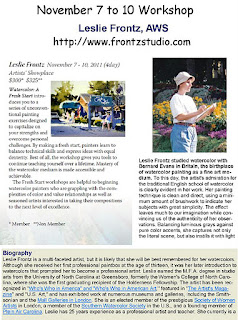
Leslie Frontz workshop.


These are paintings which Leslie produced during the workshop.  She is a very skilled watercolorist and a giving teacher.

Here is her web page:  Leslie Frontz


Saturday, November 5, 2011


Another mixed media piece using scraps of old photos.  

Saturday, October 29, 2011


I was tasked as the team lead for the Halloween decorations at the office.  We had maybe 100 kids go through the area on Friday.  The team came up with the Angry Birds theme and here is what I came up with.  The team put in a lot of hours to help make these ideas come to life (along with some internet bloggers ideas).


Friday, October 21, 2011


It looks like I have to get back in the studio, I am running out of watercolors.  Here is a mixed media piece using photos I had in my collection.  Does Katie really have all that on her shoulders?

Tuesday, October 18, 2011


From my memory and a few photos, a marsh scene from back on the NC coast. Using a wash and trying to  blend in the other shapes.  

Sunday, October 9, 2011


A little remembrance piece of the DQ back home.  Not something I would miss until it is gone, do you know those things as well?  There is a new one across he street but without the ancient sign with the eskimo and cone.  Remember the Dilly Bars?  They rocked!

Friday, September 30, 2011


A dreamy like impression of my daughter.  An image from some photos I took for a talent hunt in Dallas.  I believe the talent hunt was a questionable but I did have a few photos to have as new inspiration.  I enjoy leaving pencil lines to fill end blanks.

Friday, September 23, 2011


A mixed media piece on watercolor paper, 10 x 14.  I have had a fondness for this type of creation since art school.  Not as "easy" as it may look, finding the "designess", the sense of belonging and then the serendipity of how the puzzle fits.

Friday, September 16, 2011


A 12" x 16" watercolor of my cousin from my dad's collection of old photos.  I know I'm not the first person to dig through old b&w's of family shots and this one seemed fun.  I had to ask dad what color was this car and he was proud of the two-toned green.  It is my cousin in front of it so I bet dad wanted another excuse to take a picture of his coupe.

Sunday, September 4, 2011


A show at TCU in Fort Worth which this piece was accepted.  A mixed media piece having fun with the juxtaposition of other art work.  The artist and the muse was a favorite theme of mine and this photographer has a few muse's to inspire him.  He seems to be busy working while it is a beautiful Sunday at the park outside.

Art in the Metroplex


Post of the Metroplex show.


Sunday, August 28, 2011


Another re-do, I didn't have the bouy at such an angle this time.  Plus I handled the water differently and the wave splash on the bouy too.  I also had a solid wash for most of the bottom part as well.  This image is 10 x 14 on 140 lb Utrecht w/c paper.   I believe a more successful image than the last attempt.

Monday, August 22, 2011


An image outside of the Apollo Victoria Theatre in London.  A 12 x 16 watercolor on 140 lb Utrecht paper.  I'm experimenting with a complete wash and then building on that foundation. 

Friday, August 12, 2011


A 10 x 8 on Utrecht 140 lb paper of Susan. Well I'm getting grief that this image doesn't look like her. Well as far as I am concerned, it doesn't matter. It doesn't have to. The main thing is does it work as a w/c painting, maybe it does. And maybe it doesn't. You narrow your vision if you only worry about a likeness. As with Picasso's Portrait of Gertrude Stein, there was no concern from him that it did not look like her. Not that I'm a big fan of Picasso but I did like that quote from him, "She will" look like the portrait.

Sunday, August 7, 2011


A 9 x 12 view in Paris on 140 lb Utrecht paper.  Looking off the Petie Pont bridge on the way to the Notre Dame I took a nice photo which produced a mediocre painting.  Look for this image again.

Sunday, July 31, 2011


A mixed media 8 x 10 piece using hand made paper as well.  Done a few years ago back when I was skinner.  I did not want to have just a typical father and daughter image.  Using images from a trip to an amusement park along with my collection of images and scraps, this was created. 

Saturday, July 23, 2011


The boat in San Francisco painted a little differently than the first time.   Using a blue wash as the foundation and leaving some of the boat "paper" for white.  This wash idea was a "light blub" moment from a Frank Webb video I watched.  A simple idea but not something I usually applied to my work.  This seems to add some much needed cohesion to the piece.


Saturday, July 16, 2011


A photo was inspiration of my dad at the beach in the fifties.  A 12 x 16 piece.  Using a yellow base wash and connecting the entire piece with this wash.  Pencil lines seem to add to the flow/connection of this piece.  Hard to see but this piece has a grid outline for transferring the image.

Sunday, July 10, 2011


A greek restaurant decoration in Greek town Chicago.  This is 10"x8" on arches 140 lb w/c paper.

Monday, July 4, 2011


A 12x16 watercolor on 140 LB Canson paper.  This is an image from Chicago down from our hotel.  The museums are first rate but allow more than one day to see them.  Check out the submarine U-505 in Chicago.

Friday, June 24, 2011


A few images I liked from Paris.

From Montmartre where there are a lot of artists selling to tourist.


The famous Moulin Rouge in Pigalle or nicked named in WWII by US GI's "Pig Alley".

Friday, June 17, 2011


Produced a few years ago, a mixed media objects on 8" x 10" canvas with hand made paper.  

Tuesday, June 14, 2011


Back from a vacation in London and Paris.  Photo is from the Pompidou Centre.

Friday, May 27, 2011


A 12" x 16" effort on Utrecht 140 lb paper.  Head looks a little like a "bobble-head" toy.

Sunday, May 22, 2011

Monday, May 16, 2011


Trying to loosen up with a scene at my uncles home.  Not my best effort but I will try again later.

Sunday, May 8, 2011

Sunday, May 1, 2011


A view from the sidewalk in Charleston, SC.  This is an 8 x 10 image on Utrecht 140 lb paper.  A limited palette and an odd angle made a fun painting.

Monday, April 25, 2011


My Chinatown image with more of a nighttime look.  This is 8 x 12 on Utrecht watercolor paper.  I'm trying to loosen up on color application. 

Sunday, April 17, 2011


One more from the Botanical Gardens in Dallas and one from the State Fair of Texas 2010.

Saturday, April 9, 2011


A few examples of my trip to the Dallas Botanical Gardens using my older Pentax.